View Full Layout
Another designer at my company created a website for this client that did not entirely meet the needs of this client. As a result I was brought in to redesign their website to more closely match their specifications.
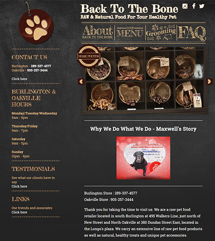
Back to the Bone is a specialty pet food store with a focus on raw and natural foods for dogs. They are heavily concerned about the quality of their products and as a result wanted their website to reflect this. Their vision for the site’s design was to be evocative of the chalkboard menus one would find at an independent coffee house or bistro: Something rustic, traditional and welcoming that still spoke to the high quality of their products.
The initial parts of the chalkboard theme were quite easy to implement: My initial designs experimented with a fullscreen chalkboard background as well as one that incorporated wooden border elements with the client ultimately preferring the simpler version without a border. The first major design challenge came in the form of font choices for the site: In order to keep with the theme of the site I chose the sketchy, highly decorative font Fredicka the Great for the majority of the site’s headings while using the more legible Roboto Slab for body copy and subheadings in order to preserve readability.
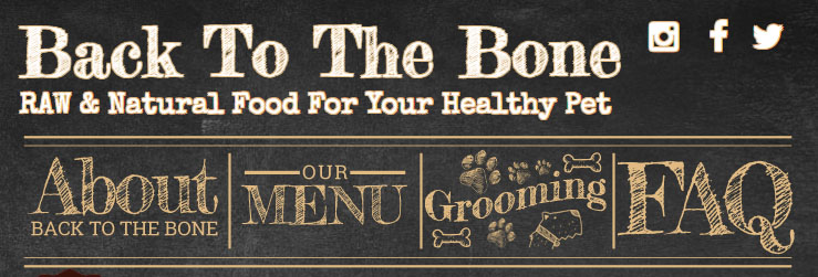
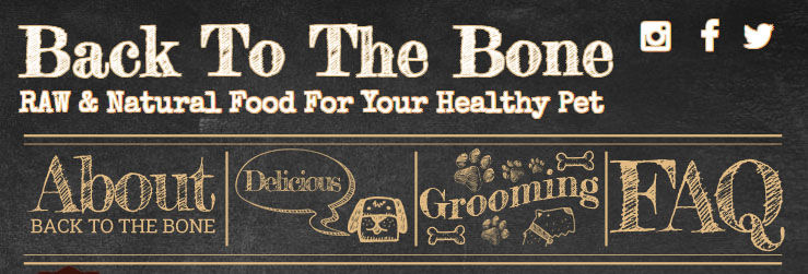
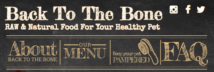
The next major element requiring special attention was the navigation menu proposed by the client: They wanted something highly decorative and image-based with each image in the nav changing on hover. The site they provided with an example of this style of menu utilized the at this point relatively dated “onmouseover” image property. While this method certainly gets the job done, it lacks a number of more aesthetically pleasing options that other methods could achieve. For simplicity’s sake I decided that the use of pure CSS styles would be the best way to achieve the hover effects the client wanted for the menu.
After creating the image content for the menu it was a relatively simple matter of layering images on top of one another using absolute positioning in CSS, setting the opacity of the images depending on whether a visitor had hovered over them, and applying CSS transitions to ensure the change between the two images on hover would be smooth and seamless. The result achieved the effect the client was looking for in a way that went beyond the example they had originally provided.
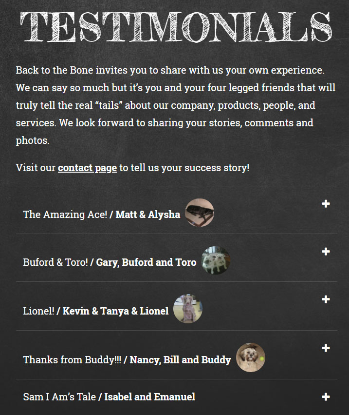
The final feature that was required for this site was a way to showcase a large number of testimonials, products and other information without overloading the viewer with information and requiring excessive scrolling. The obvious and simple solution to this problem was the implementation of accordion drop-downs that could showcase the title and initial information of products and client testimonials and provide visitors with more information when this information was clicked on. Creating these accordions was a simple matter of writing some quick code in jQuery and styling the results with CSS.
The final product was greatly appreciated by the client, meeting their original requests and taking them even further to create a site that perfectly represented the mission statement of their business.

