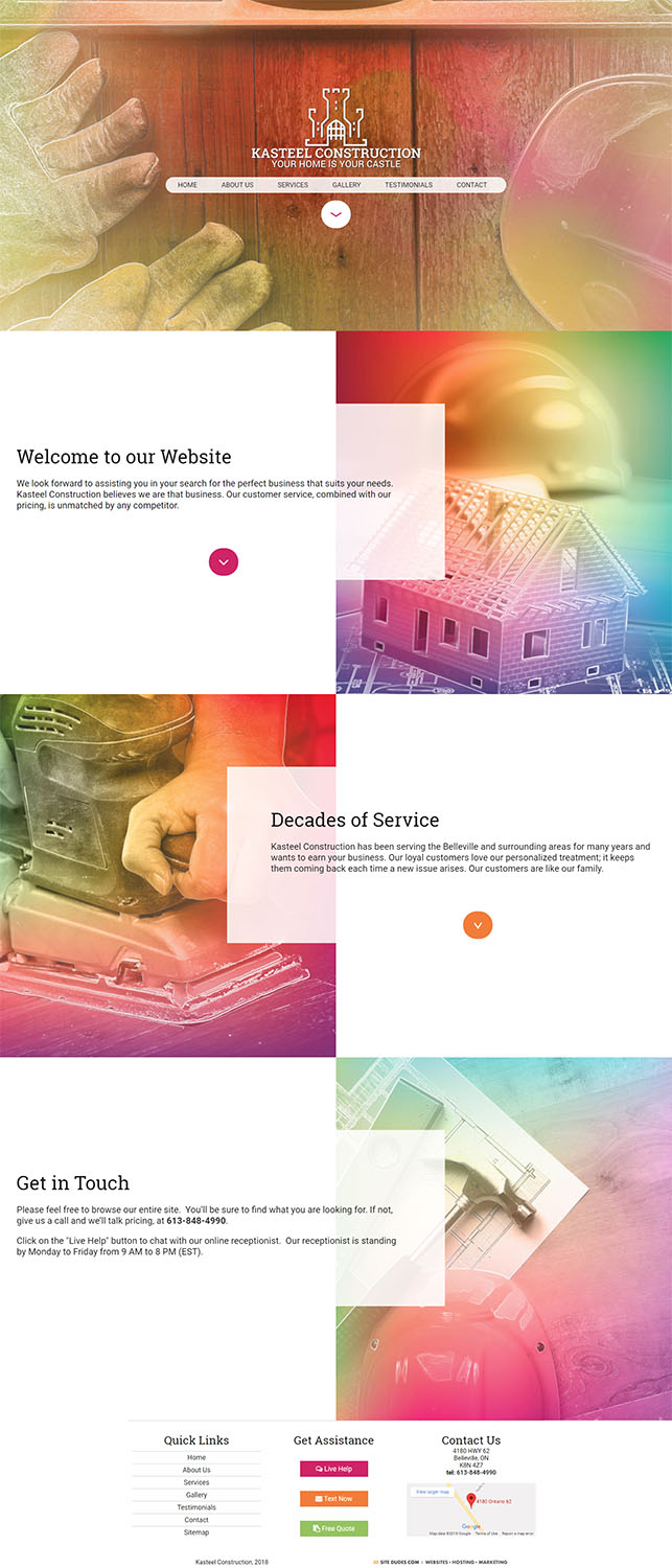
View Full Layout

This client, who had not yet tackled the details of their business identity, left the majority of the design and content of this site up to us. I began from the client’s company name in brainstorming the identity of the site. The first thing that came to my mind when presented with the name “Kasteel” was the obvious similarity to the word “castle” which itself brings to mind images of the archaic and traditional. After some consideration I decided to deviate from the obvious and went with a much more hip, modern design than that which the name originally brought to mind.
This project came about a little over a year after the rebranding of Instagram and the controversy of their design choices were fresh on my mind. I decided to look to the design choices by the Instagram team for inspiration in my quest to give this site a hip, nontraditional brand identity.
I took some images traditionally associated with contractors and applied a colourful gradient overlay to give them a brighter, more modern aesthetic. As we had received little in the way of text content from this client I decided to combine what we had with the imagery I developed to lengthen the homepage and provide the illusion that the site had a greater amount of content than it actually did.
With content spread so far apart on the homepage it became necessary to find a way for visitors to easily browse through this content without excessive scrolling. The solution was to set up smooth scrolling through the jQuery plugin waypoints.js and, through clever use of anchor links, create a way for visitors to jump from one section of the homepage to the next at the click of a button.
The final product achieved the design sensibilities I had set out to create and resulted in a pleasant contrast between bright colours and stark white that left the client happy.
